When choosing a colour scheme for an office project, it is worth considering three things; colour psychology, relevant trends, and the goals / ethos of your client’s company.
The psychology of white
White office walls can sound appealing and are often requested by many business owners. Whilst white symbolises cleanliness, calm, purity and new beginnings, it can also look very clinical and depressing when used in large spaces. Experts recommend using white in small spaces that will feature large items of furniture, such as kitchens and breakout areas. They also suggest you balance out the whiteness with darker neutral materials, like grey fabric sofas in a staff room or black marble kitchen surfaces. This will add the positive connotations of white and the calming balance of dark neutrals.
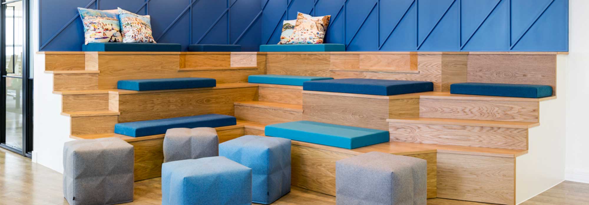
Red and blue
Pops of colours like primary red (warm, exciting and vibrant) and primary blue (trust, security and order) should be used in offices with a lot of noise and bustle. If you’re designing a sales or marketing space or creative area, those colours are perfect. To keep pops of colour on trend, use against ‘natural’ wall finishes. If your client is lucky enough to have a feature wall – perfect. If not, you could consider creating this – Paragon can certainly help.
Natural wood
Natural materials emulate the relaxing feelings of the outdoors. The use of a natural material across a large area such as the floor will add a light and relaxing feel to any office.
Dark wood floors are more synonymous with the home; opt for glossy white desks to offset this with the clinical connotations mentioned earlier. This will help to strike an optimal balance between feelings of home relaxation, against work and productivity.
Incorporating colour into office furniture
When used correctly, office furniture provides an opportunity to perfect an office colour scheme. You can uplift natural colour schemes with pops of colours through luxurious fabric finished chairs or bleachers. If pops of colour have been used on the walls, use varying tones of these colours within the furniture. This creates a seamless transition for the eye.
It is worth considering here, if the client’s brand colours can be reflected in the furniture and walls. The material used should also reflect the image that the client wishes to portray, natural or more industrial for example. The furniture and fabric colours chosen will significantly impact on whether that overall on-brand feel is achieved.
We suggest working with lighter shades of colours synonymous with relaxation. Blue will bring in feelings of calm, security and trust. Green symbolises renewal and growth, and will tie in beautifully with natural schemes. Don’t be scared to add pops of colours that symbolise luxury like gold, silver and black, especially if that is on brand.